Thomas Henry Greybe

Creative Director (Digital & Content)

Jaguar Land Rover

A digital companion
for their global auto shows.

Bridgestone World

Online experience in webGL.

eBay Open 2022

eBay's large scale seller event to celebrate their entrepreneurs.

La Espanola Oliography

An online campaign for a well known Olive Oil brand.

Vodafone Brand

Branding, design and animation for the new positioning, The Future is Exciting.

Lloyds FYNS

Art direction for a 360 campaign, For Your Next Step.

Man On The Moon

John Lewis Online advertising for the Man On The Moon campaign.

Sky Mobile

Launch of a new mobile network online.

Halifax Top Cat

Bringing a classic cartoon to modern browsers.

Acer/INTEL Superstar DJ

Global advertising campaign for a chip giant.

Morrisons Brand

Digital brand guidelines for the launch of Morrisons online grocery delievry.

Explore Beyond Limits

Megan Fox and Kiefer Sutherland to show how Acer helped them explore beyond their limits.

Invisalign Pop-up

Interactive engagements in a physical experience.

Canon Pixma

A documentary based on the science behind the advert.

Jaguar Land Rover

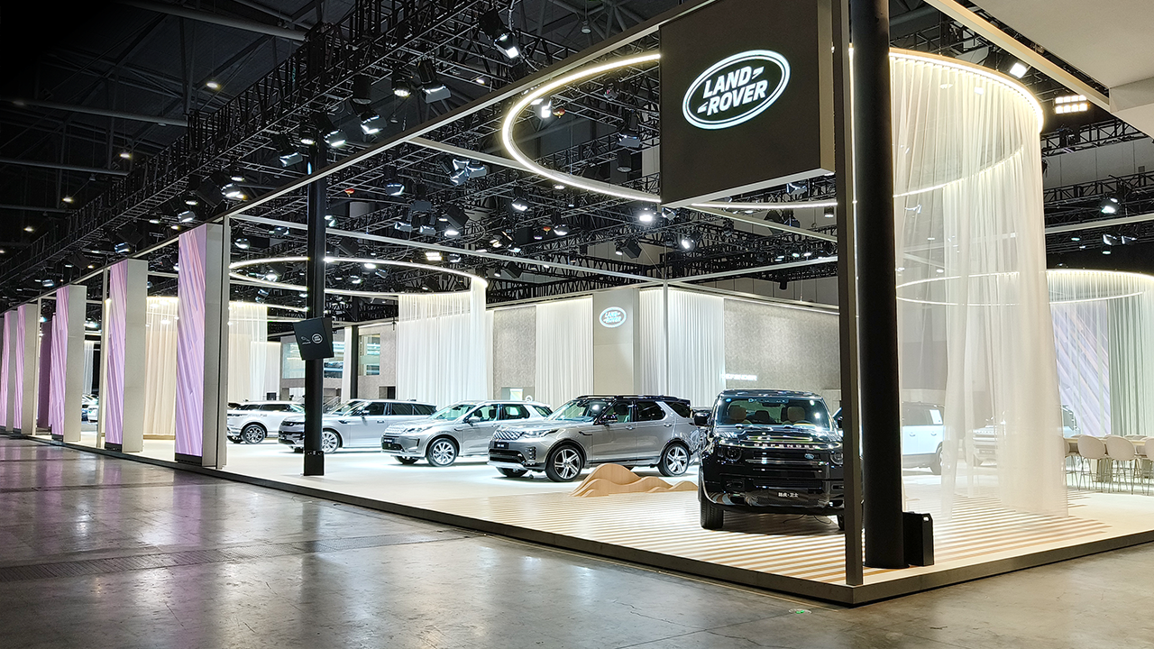
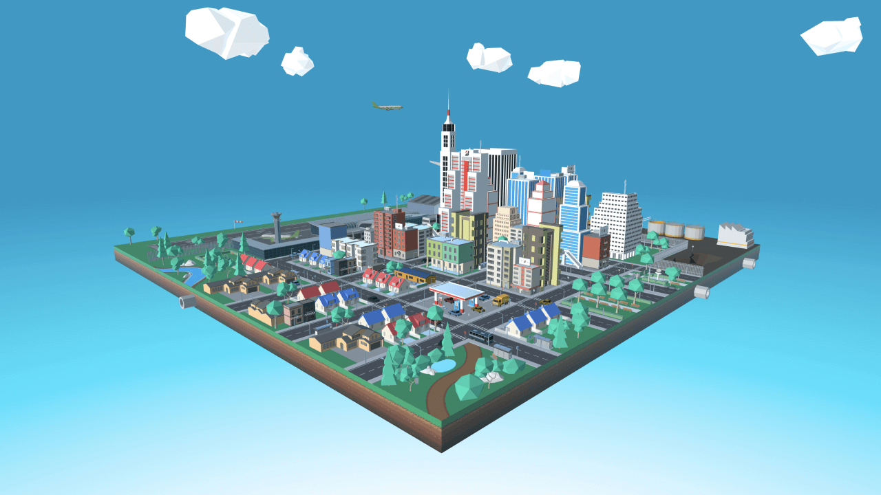
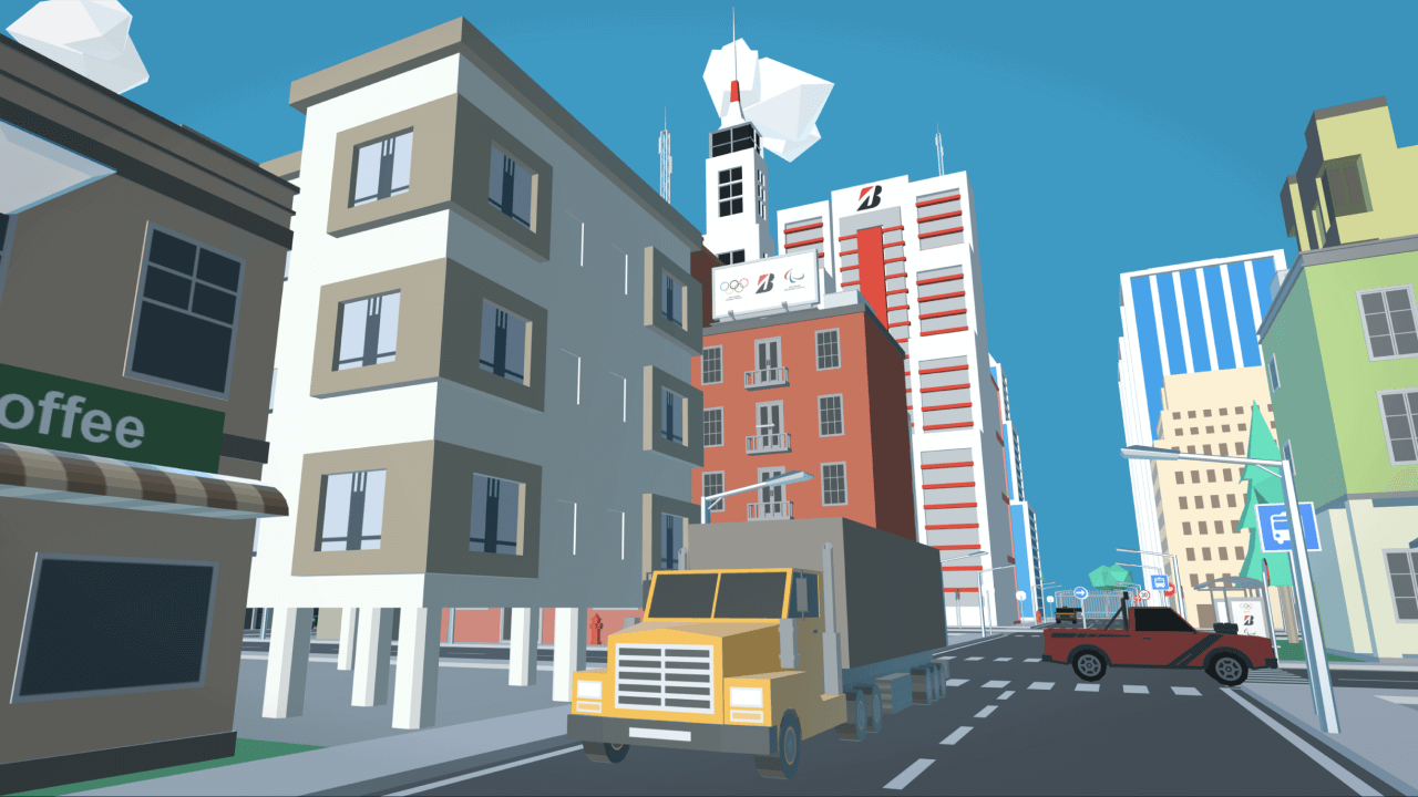
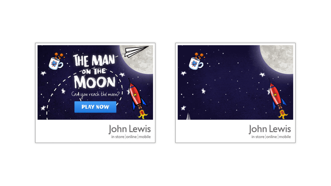
Part of Avantgarde's remit to deliver global auto shows for Jaguar Land Rover was to support the experiences from a digital as well as physical side. My role was to dovetail into the main creative and 3D structures to create a harmonious link between the two entities. The JLR brand was going through a new positioning, defining themselves firmly as luxury vehicles, our design needed to feel effortlessly premium while staying true to the heritage brands.

    Response:
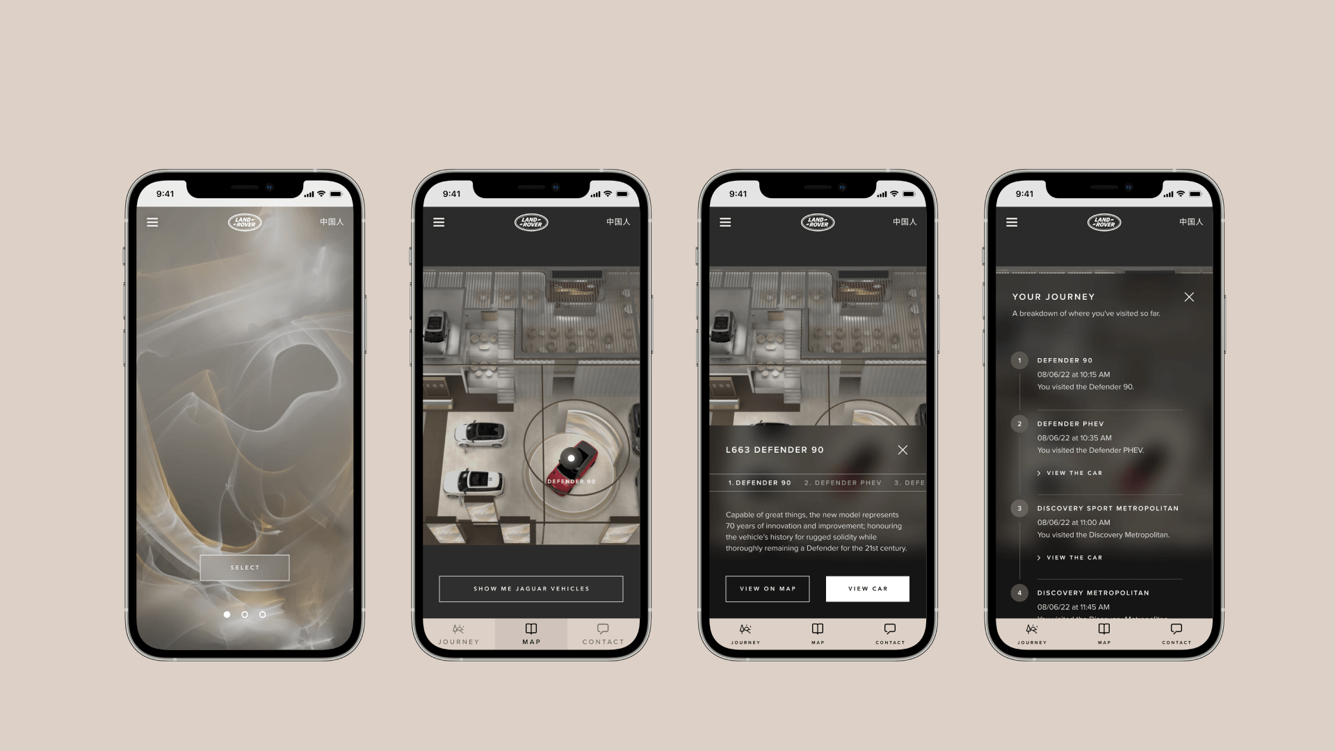
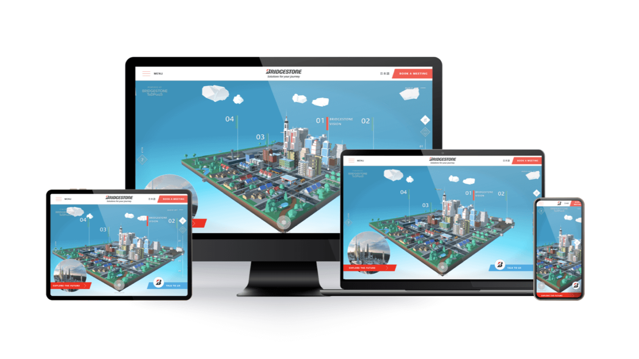
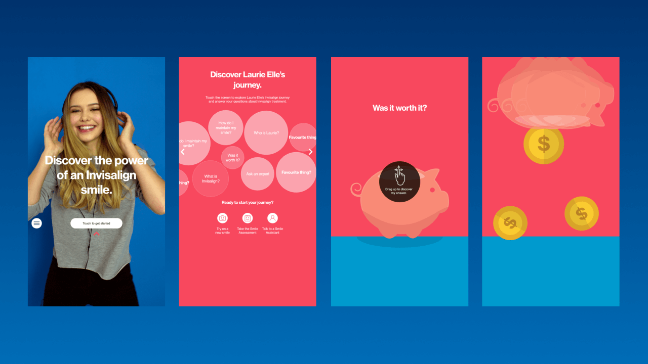
  • ✓ Mobile only digital companion - that tracked where and what you had interacted with.
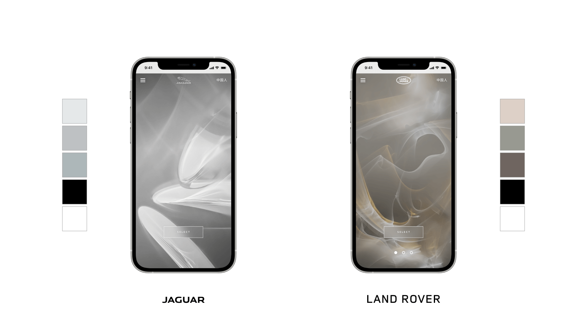
  • ✓ Defined a digital style guide to maintain brand unity between physical and virtual touch points.
  • ✓ Developed a linked narrative that supported the main creative around 'Pieces of Art' in a gallery.
  • ✓ Designed a patterning style that could easily be re-skinned and wholly defined as either Jaguar OR Land Rover.
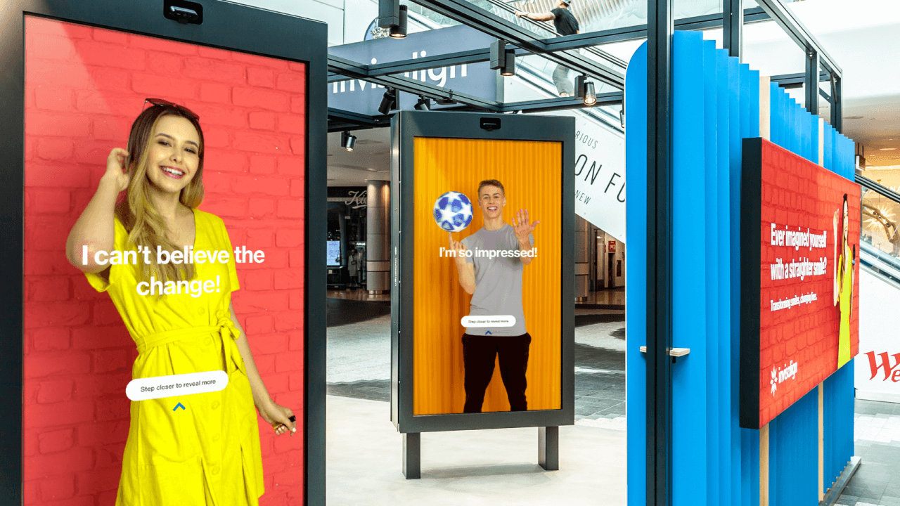
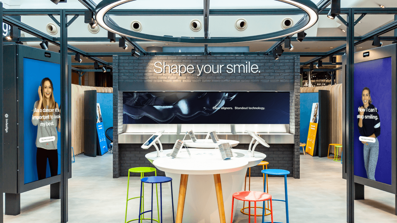
  • ✓ Created and defined interactive controls for the large scale totems that feature artwork by Field.

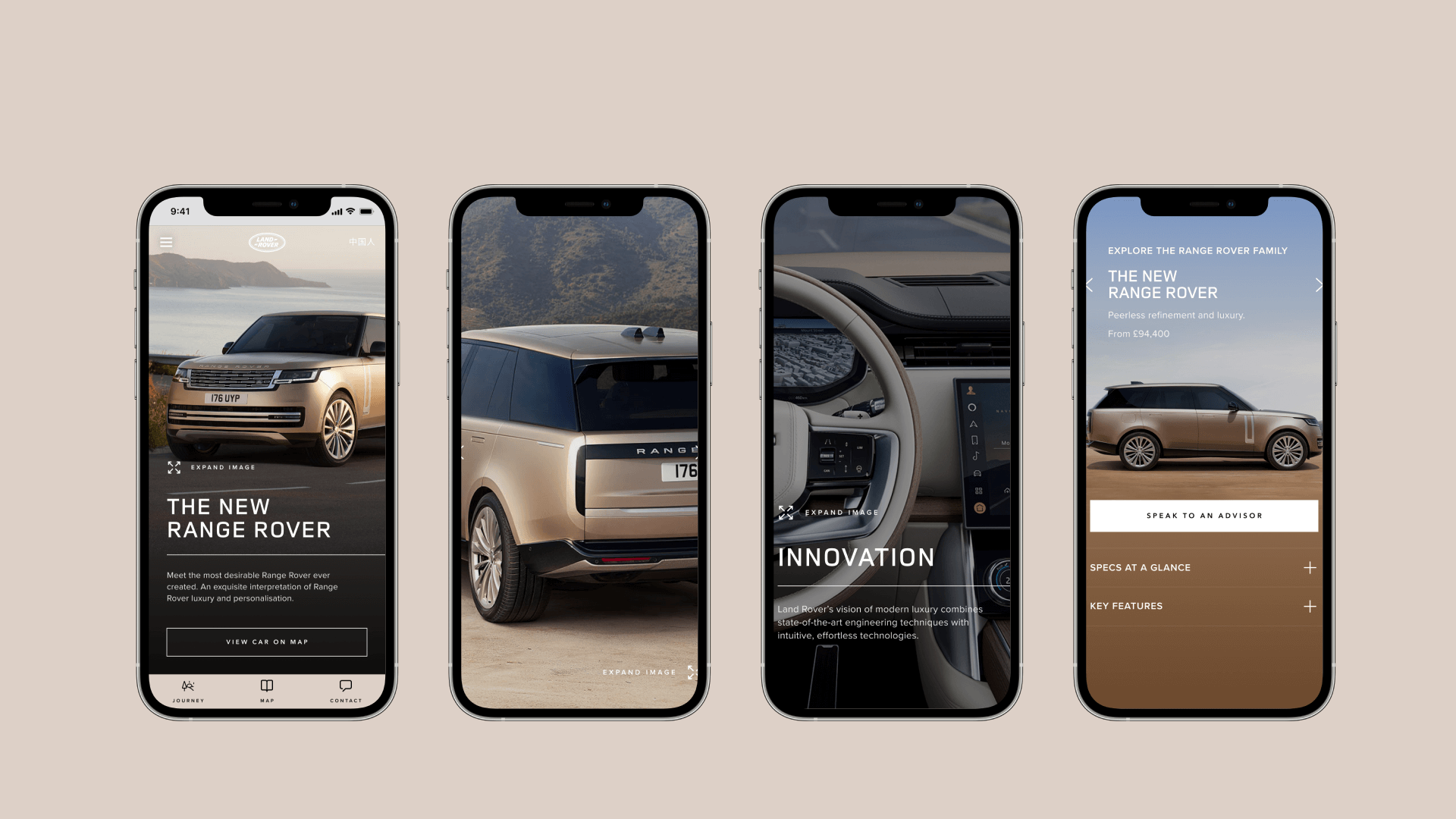
Working tirelessly with the development partner in Shanghai we delivered a best in class digital companion that made users feel connected to the spaces, while letting them move around not bound to digital screens, but they're own device, this let the user pick up where they'd left but at home, capturing and keeping leads, that ultimately led to more sales. Needless to say the client was ecstatic and the digital companion is now part of every auto show moving forwards.

Bridgestone World

In 2021, due to the global pandemic, the annual Consumer Electronics Show (CES) was held virtually. Bridgestone America saw this as an opportunity to stand out from the crowd and showcase their brand. We needed to create a unique and impactful virtual world that completely represented all of Bridgestone's current and near term initiatives, while also allowing them to highlight the real world benefits of their products.

    Response:
  • ✓ Metaverse-esq real time 3D world that depicted the various ways in which Bridgestone, as a mobility company, touches the community.
  • ✓ The world was broken into four distinct areas: urban, suburban, transport, and industrial.
  • ✓ Working with 3D artists, motion designers, unity programmers and game developers.
  • ✓ We devised game mechanics for traffic and narratives within the real-time webGL platform that highlighted how their products affect communities.

The site helped Bridgestone stand out from the crowd and be shortlisted in the top 5 best microsites for CES by Apple news. This unique and impactful experience allowed Bridgestone to tell their stories effectively and showcase the benefits of their products to their target audience. It was so well received by the parent company that they translated it into Japanese and kept the website online.

eBay Open 2022

eBay UK holds a premium event each year to reward its best sellers. This was to be their first fully physical event since the COVID-19 pandemic so they needed to go big by enhancing the narrative, scale, and content of the event. We were responsible for the overall creative vision of the event while incorporating eBay's recent rebranding, which was bold and colourful. Additionally, the event was to be primarily physical, but they also wanted a hybrid nature to it.

    Response:
  • ✓ Developed a festival theme, by embracing their bold and colourful rebranding into the event design and experience.
  • ✓ Playing heavily on the 4 primary colours of eBay’s re-brand, we designed 3D spaces split into colours/areas that were dedicated to logical functions.
  • ✓ Created bespoke large scale animations and branding for the event.
  • ✓ All sessions were captured by a multicam crew and director. Which were then edited and graded to be released online later.

This was a premium event that successfully elevated eBay's narrative, scale, and content. Comments from the client included “Absolutely Brilliant! It was a seamless, polished, professional and outstanding representation of the brand”, and “It was an amazing event, big ‘well done’ to all involved!!” The bold and colourful rebranding was well incorporated into many facets of the experience, resulting in a memorable day.

La Espanola Oliography

La Espanola is a Spanish Olive Oil brand with a unique story. They know the exact origin of every olive in each of their bottles. Our challenge was how to tell this story. We needed to create an online storytelling experience that showcased the journey of La Espanola's Olive Oil from the farm to fork. The goal was to capture the very essence of the harvest season, and convey it to the customers through a variety of channels.

    Response:
  • ✓ Capture each part of the process from the farm, the harvest, and all the way up to delivery.
  • ✓ Blended our visual tapestry of videos, illustrations, pictures, audio, and text into a unique online storytelling journey that was different each time you visited the site.
  • ✓ Filmed original content on site in Andalusia during the harvest season, capturing every aspect of the process from the farm to bottling.
  • ✓ Developed custom music that changed as you scrolled, with custom illustrations depicting parts of the journey.
  • ✓ Designed a mobile, desktop and tablet website featuring custom illustrations.

The experience offered the customers something completely unique; the ability to experience the entire journey of their bottle of Olive Oil by simply entering the LOT number found on the back of their bottle. The in-store activations and social media support helped drive traffic to the online platform - supported in desktop, mobile and tablet, giving greater transparency for La Espanola to showcase their unique story about providence.

Vodafone Brand

During a rapid and large-scale global rebranding project for Vodafone, Brand Union brought me in as a Digital Design Director to support their Creative Director and extend the work into the digital landscape. We needed to define a core set of digital principles derived from the new Vodafone positioning, and to develop a robust and strategic approach to their communications.

    Response:
  • ✓ Set out to create an atomic design pattern that could be up-weighted with various elements.
  • ✓ Strategic approach was to flex branding and messaging based on the digital landscape, making communications more relevant to each channel, and allowing for specific KPI's to be dialled into each execution.
  • ✓ Elements were broken down into components, allowing for a softer approach when incorporating them into communications which could then be used as levers across various digital formats.
  • ✓ Animated and curated motion for end frames and digital assets.

A flexible and strategic approach to digital communications offered Vodafone a way to engage with audiences in digital channels that could be adjusted for each relevant execution. This helped create a consistency for the brand's core values and positioning across multiple channels while still positively communicating Vodafone's message.

Lloyds FYNS

Lloyds Banking Group briefed adam&eveDDB with a new brand campaign and I was attached to help guide the digital creative. Concurrently the brand was being re-branded by Rufus Leonard in a new design direction. I worked with the Creative Directors to help deliver a coherent and thoughtful message about the emotions of life's next steps, whether it be bereavement or joy.

    Response:
  • ✓ Created guidance to ensure that the content was not only impactful but could also be used for multiple formats.
  • ✓ Worked with the production team on set to ensure that the best material, ratio and resolution were captured for maximum flexibility.
  • ✓ Set up new art direction and design patterning for the digital content and devised different layouts for various digital formats to ensure flexibility for multi-channel usage.

The campaign succeeded in delivering a coherent and thoughtful message about the emotions of life's next steps, using the digital medium to it's full effect. The digital out-of-home, in combination with the print, slow-motion video, and the new art direction, made the content more engaging and eye-catching. The resulting work perfectly captured the intended message and received positive feedback from the client.

Man on the Moon

In the run-up to Christmas, I joined adam&eveDDB to support one of their famous Christmas campaigns, the John Lewis ‘Man On The Moon’. My role was to lead the art direction for the digital assets for the campaign. We needed to create a unified look and feel across all digital deliverables and digital advertising concepts, with a clearly defined layout and style for all our digital communications.

    Response:
  • ✓ Develop the core idea further for digital retail online media.
  • ✓ Refined and rolled out the designs to all digital communications.
  • ✓ Developed bespoke video format banners to promote the TVC and encourage traffic to watch the John Lewis Christmas advert.
  • ✓ Bespoke interactive advert in partnership with ITV for X-Factor, featuring navigation, videos, and content about the campaign app.

The campaign was highly successful and received positive feedback from the client and the public. This contributed to the overall impact of the campaign and helped to drive engagement and traffic to the John Lewis site.

Sky Mobile

adam&eveDDB was tasked with the launch of Sky Mobile's new offering, and I was an integral part of the team that won the pitch. The main objective was to develop and craft Sky Mobile's online toolkit, implementing the core principles defined by the branding agency venturethree, and delivering a core set of online media.

    Response:
  • ✓ Art direct, ideation and concepting for all the digital assets.
  • ✓ Guidelines were defined to feature patterning based on the main logo.
  • ✓ Custom animations were created with the 3D artists in house for the online assets.
  • ✓ We also explored split-testing on buttons, layouts, messaging and formats to achieve optimum digital cut through.

The launch of Sky Mobile and the online toolkit effectively maintained the brand's messaging. The unified look and feel, and the vibrant colours and web accessibility helped attract the target audience. Overall the work was well received and made a lasting impression.

Halifax Top Cat

Halifax Bank tasked adam&eveDDB with creating a new ATL direction for their brand and I was attached to help guide the digital creative. I worked closely with the branding agency Rufus Leonard and the creative directors to ensure Halifax's playful approach to banking was reflected in the digital assets. The main objectives of the project were to develop a new ATL direction that reflected Halifax's unique approach to banking, created a flexible digital design framework that supported a variety of banners, and incorporated the brand's new colour scheme and layout approach into the digital assets.

    Response:
  • ✓ Incorporate their new design direction into a digital style guide working with Rufus Leonard.
  • ✓ 'Blue Glue' was used to develop a flexible design framework that supported a variety of banners.
  • ✓ Established the 'X' as a framing device for content and part of a functional device for transitions.
  • ✓ Art direction, concepting, and briefing into The Mill for all digital animations.

We accurately reflected Halifax's playful and un-bank-like approach to banking through the use of cartoon characters and a brand new colour and layout approach. The flexible design framework and digital style guide ensured consistency and coherence of the brand across all digital assets. The interactive rich banner performed well and directed users to engage with the communication. Overall the client was very happy.

Acer/INTEL Superstar DJ

I was the lead digital art director for the global campaign of Acer/INTEL. Featuring the superstar DJ Tiesto, and his assistant. I was responsible for ideation and developing ideas while ensuring creative consistency, working with junior designers and the Creative Director Danny Brooke-Taylor.

    Response:
  • ✓ Art direct all digital media assets required for the global campaign.
  • ✓ Attended all live action shoots in North America.
  • ✓ Managed TAG and Mediamonks who were responsible for the build and online media respectively.
  • ✓ Created a global landing page for 14 different regions.

The global campaign was a great success, completely outstripping all previous campaigns. The dwell time was up more than 200%, with a low bounce rate of 20%. Mobile online media performed particularly well, with a clickthrough rate average of 1.6%.

Morrisons Brand

As part of their online grocery launch we needed to create digital brand guidelines, which involved interpreting their existing guidelines set out by the main estate and incorporating digital considerations. Defining HEX colours, implementing accessibility and responsive best practices, establishing button definitions to maintain consistency across digital estates and devices, and creating a distinct rhythm and pacing for digital sites created by third-party agencies.

    Response:
  • ✓ Created included detailed schematics and measurements.
  • ✓ Best practices for digital were implemented to increase accessibility.
  • ✓ Unified measuring element was created to set a pacing and rhythm to the page.
  • ✓ HEX colours, button definitions, and core logo elements were all designed to maintain consistency across all digital estates and devices.

The digital brand guidelines provided a comprehensive guide for Morrisons' digital presence, ensuring consistency, accessibility, and responsiveness across all devices. The unified patterning, measuring element, and rhythm helped to create a cohesive look and feel for all digital sites created by 3rd party agencies.

Explore Beyond Limits

Mother London was tasked with creating a global set of online media for the Acer/Intel campaign featuring Megan Fox and Kiefer Sutherland, highlighting how Acer computers help ‘Explore Beyond Limits’. As part of my deliverables we needed to create a localised suite of high-quality online media, a mini-site that fully captures the campaign, and a design that's responsive across multiple touchpoints.

    Response:
  • ✓ Designed rich flash banners that included an expanded unit with stock flames comped into the expansion for added effect.
  • ✓ The banners were designed to be responsive, enabling access from multiple devices.
  • ✓ A landing page was created to showcase the campaign, fully representing the message of the campaign.

The global suite of online media was a success, showcasing the message of how Acer computers can help users ‘Explore Beyond Limits’. The rich flash banners and landing page were well received and had a positive impact on the campaign. Additionally, the responsive design allowed for easy access from multiple devices.

Invisalign Pop-up

Invisalign is a market leader in the orthodontic industry, offering innovative technology to straighten teeth without traditional metal braces. The brand wanted to raise awareness of its leadership within the market and communicate its pioneering technology to customers in a meaningful and engaging way that attracted and immersed them into the Invisalign brand and product story, while encouraging them to get into direct dialogue with well-trained brand ambassadors.

    Response:
  • ✓ Collaborated with Checkland Kindleysides to create a branded pop-up store in the heart of Europe’s largest mall.
  • ✓ Designed to be an interactive experience, with a precisely mapped journey for every target audience.
  • ✓ Made a variety of digital touchpoints, including "Smile View," which allowed customers to view before and after images of their teeth in seconds.
  • ✓ Large touch screens, which were camera-activated, and incorporated gamification elements with digital content with influencer stories to appeal to a younger audience in a fun and dynamic way.

The Invisalign pop-up store was praised for raising awareness of the brand and accurately communicating its pioneering technology to customers. The interactive experience allowed customers to engage with the brand and product, leading to increased interest in the Invisalign solution. The digital touchpoints, such as "Smile View," helped customers understand the potential results of treatment and the gamification elements kept the younger audience engaged in the brand.

Canon Pixma

Invisalign is a market leader in the orthodontic industry, offering innovative technology to straighten teeth without traditional metal braces. The brand wanted to raise awareness of its leadership within the market and communicate its pioneering technology to customers in a meaningful and engaging way that attracted and immersed them into the Invisalign brand and product story, while encouraging them to get into direct dialogue with well-trained brand ambassadors.

    Response:
  • ✓ Collaborated with Linden Gledhill, a micro photography artist, to create a captivating video that would showcase the printer's capabilities in a unique and memorable way.
  • ✓ Responsible for directing, shooting, and editing the "making of" documentary film for the Canon Pixma advert.
  • ✓ Used a 5D MkII camera and edited the final cut.. All graphics were created in house, with sound cleaned up by SNK Studios and a final colour grade added.

The "making of" documentary film outperformed the principal advert with impressive statistics. During the campaign the documentary had been played 413k times and had 1,547,970 loads, while the other films (including the principle film) had only been played 74k times with 303k loads. This demonstrates the effectiveness of owned media and the impact it had in showcasing Canon's new printer.

Get in Touch

  • I’m a hands on multi-disciplinary creative, who helps deliver immersive and integrated experiences across multiple touchpoints. I began my career as a developer, giving me a deeper understanding of the underlying technology, and how to use it to its full potential. I strive to create work that is as effective as it is engaging.

    My main skills are concepting, art direction, design direction, and strategic content development with storytelling as the driving force. I lead projects and mentor teams, I am client-facing and confident in presenting creative work.
  • Thomas Henry Greybe
  • thom@greybe.com
  • London, UK

WORK

T:H:G - CREATIVE DIRECTOR

CONTACT